Inside the Dripos Rebrand: Designed for the Coffee Community

I joined Dripos at the end of October of last year – in the midst of Q4, one of the busiest times of the year for the coffee industry (and honestly really any company).
While many people might expect to spend their first few months slowly onboarding, learning the landscape, and grabbing a coffee with new coworkers, I was immediately tasked with leading the creative for Dripos’ rebrand – a challenge I was not going to take lightly.
I'm Danielle Grinberg, Art Director at Dripos — and notably, the first Art Director in the company’s history, joining as part of a brand-new marketing department. It’s incredibly impressive that Dripos achieved so much success since launching in 2019 without a clearly defined brand vision. That growth is a testament to a company deeply rooted in human connection, driven by dependable customer support, implementation, sales, and product teams.
A Tech Brand Built on Human Connection
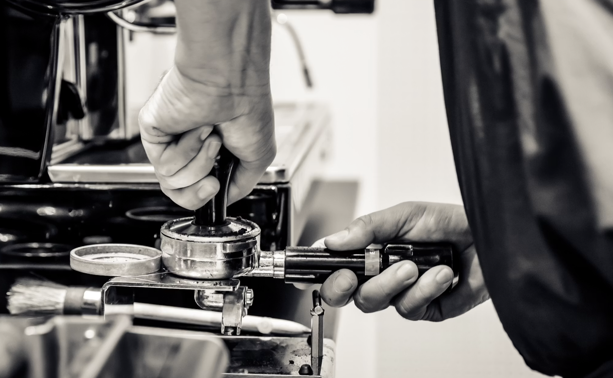
While we are a tech company at our core, my first impression of working here was nothing like what I expected from “tech.” I come from a world where stakeholders are referred to as “the client.” At Dripos, we’re on a first-name basis with shop owners. From day one, it was clear that this rebrand, while absolutely a visual evolution, needed to be grounded in the same sense of community and human connection that drives both Dripos and the coffee industry at large.
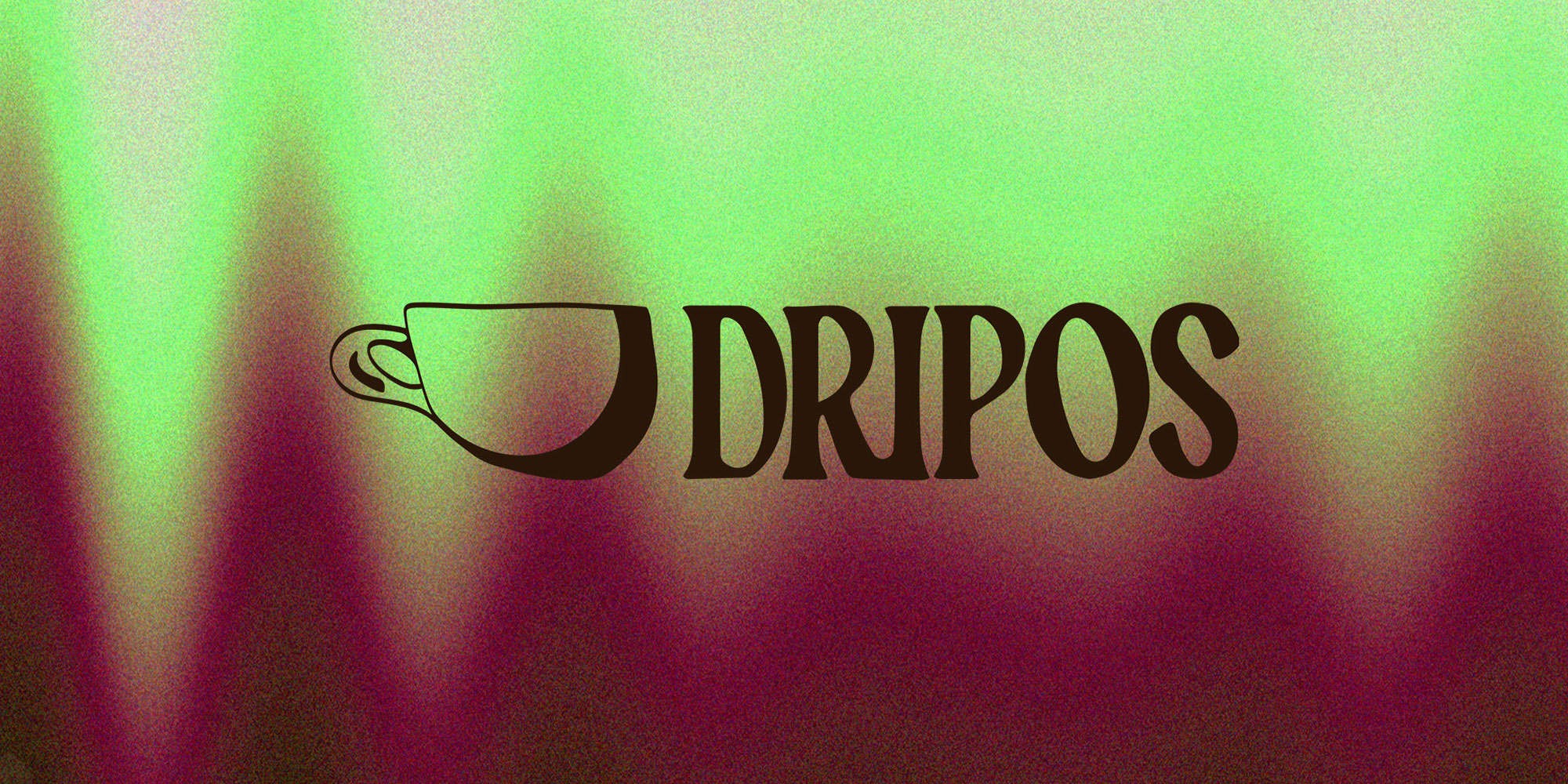
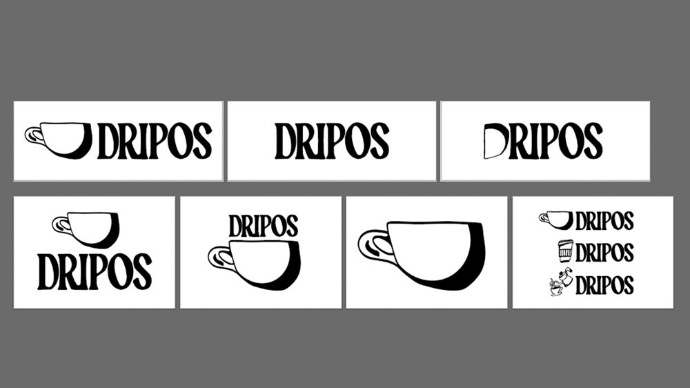
Versatility became a guiding principle in developing the Dripos logo. We needed a mark that could adapt across formats: a wordmark and symbol that could work together or independently, horizontally or vertically, while still feeling cohesive. The logo had to feel distinct and custom, yet live comfortably within the broader brand system we were building through our website redesign, color palette, and typography.
We created a custom wordmark, using Makawao by Taylor Penton, modifying letterforms with subtle connections and curves to reflect the interconnected nature of how Dripos operates with our shops and partners, and how the coffee industry itself thrives on relationships. Outside of the logo, this typeface is used nowhere else, preserving its uniqueness within the brand system. While ideating a symbol, we explored many avenues: the swirl of espresso and milk, machine equipment, coffee beans. In the end, the solution was right in front of us – an organic, hand-drawn coffee mug that when flipped on its side, subtly forms a capital “D”, while the mug’s handle reads as a droplet of coffee. The mug is equally as important as the typeface, and while it serves to always be used together, the symbol is strong enough to live on its own and still feel unmistakably Dripos.
Another main goal was to rethink how tech brands can look, feel and show up in the world. While one of our brand fonts, Fraktion Mono from Panagram Panagram Foundry has the tech-y look, we paired it with Roslindale from David Jonathan Ross, a slick and contemporary serif to infuse a sense of style and unexpected edge. It’s the norm to steer away from a serif in the tech world, but we always looked at trends in independent coffee shop design – and of course, who better to inspire us than our own customers?
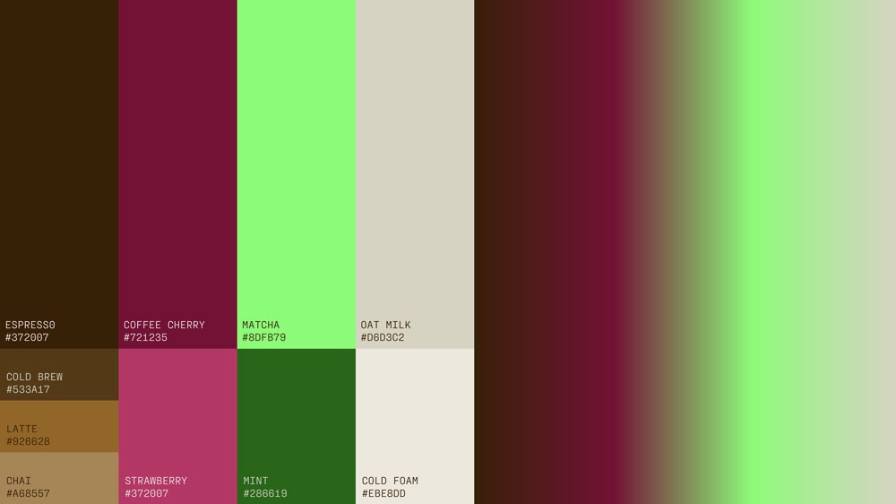
Dripos’ new color palette marks a dramatic shift from the original. Gone are the slack-esque purples, yellows, and reds. In their place is a palette rooted in coffee itself: rich brown and warm beige neutrals. Rather than using stark black, we use a velvety Espresso color. A milky beige, aptly called Oat Milk, takes the place of anytime we’d use white. Energizing the palette, we introduced Matcha – a neon green that pops against the darker tones, and Coffee Cherry – a gorgeous deep maroon with hints of pink that gives us more to play around with.
All of this is anchored in our new website – likely one of the first touchpoints our prospective shops see when googling us for the first time. Using a mix of art direction styles – hand-drawn illustrations, vibrant and soft photography, video, and 3D-rendering, we created a world that will allow Dripos to work with artists of diverse styles as we continue to establish the company as a brand rooted in and prioritizing art and design. One of my favorite parts of the rebrand is the evolution of our company publication, Counter Talk. I’m excited to bring my background in editorial food and beverage storytelling into this space as we highlight the voices of shop owners and baristas. We may be a tech company, but the people behind the counter are our celebrities, and their stories deserve the spotlight.
Over the next few weeks, I encourage you to explore the new site and watch our latest video: a testimonial featuring ansā Micro Roastery, one of our beloved NYC customers. It was an absolute joy to produce, even on a freezing December day. We’ll continue rolling out new brand expressions and materials throughout the coming months and into 2026.
In the meantime, if you have feedback or want to talk about featuring your shop in a creative way, I’d love to connect. Reach me at danielle.grinberg@dripos.com